Zoom UI Redesign
More meetings are going virtual due to the pandemic. Video conferencing products such as Zoom, Room, and Google Hangouts are thus gaining people’s attention.
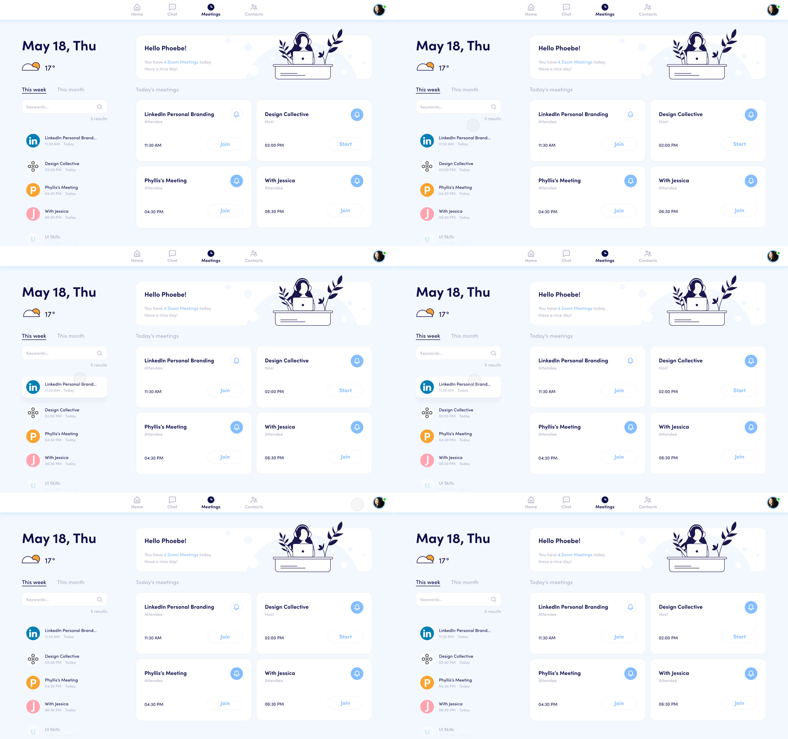
As an active user of Zoom, I would like a relaxing Zoom Meeting interface, which informs me of the meetings concisely. So I took the challenge to redesign it by making use of expandable cards and illustrations.
With the new interface, users can quickly learn about their daily meetings by interacting with content cards. Quick search is also enabled for users to search for any scheduled meetings.
Role: UX Designer, UI Designer, Illustrator, Motion Designer
Team: Self-Initiated Project
Duration: 5 weeks (2020)

Heuristic Evaluation
1.
The layout of the meeting card is too crowded, which makes it confusing for users to digest the information.
The dates are not grouped well with the meetings. Users need to take extra time to figure out if the date above the meeting card is the correct date or the one below it.
2.
The search box is only for files and contacts search. Users are not allowed to search for meetings.
3.
The content hierarchy is not clear.
The information is not properly grouped.
Too much meaninglessly repeated information takes up the whole section, which leads to the insufficient use of this area.
Feature 1: Efficiently inform users of their daily meetings.
Daily meetings always come first. I used expandable content cards to provide information about meetings. Also, the banner tells users how many upcoming video meetings they have. In case of awkward silence when meeting new people, I designed a small weather animation in the top left-hand corner to provide an ice-breaking topic.
Feature 2: Find meetings faster.
I moved the quick search box down to allow users to search for specific meetings. Users can use the filter and keywords when searching. The quick search box serves as a meeting library that includes all scheduled meetings.
Feature 3: Meetings are no longer stressful.
I redesigned the interface to make a relaxing video conferencing environment for users. Blue is considered a calm color, so I decided to adopt a blue-based color palette. I also created some illustrations to give more energy to the interface.


