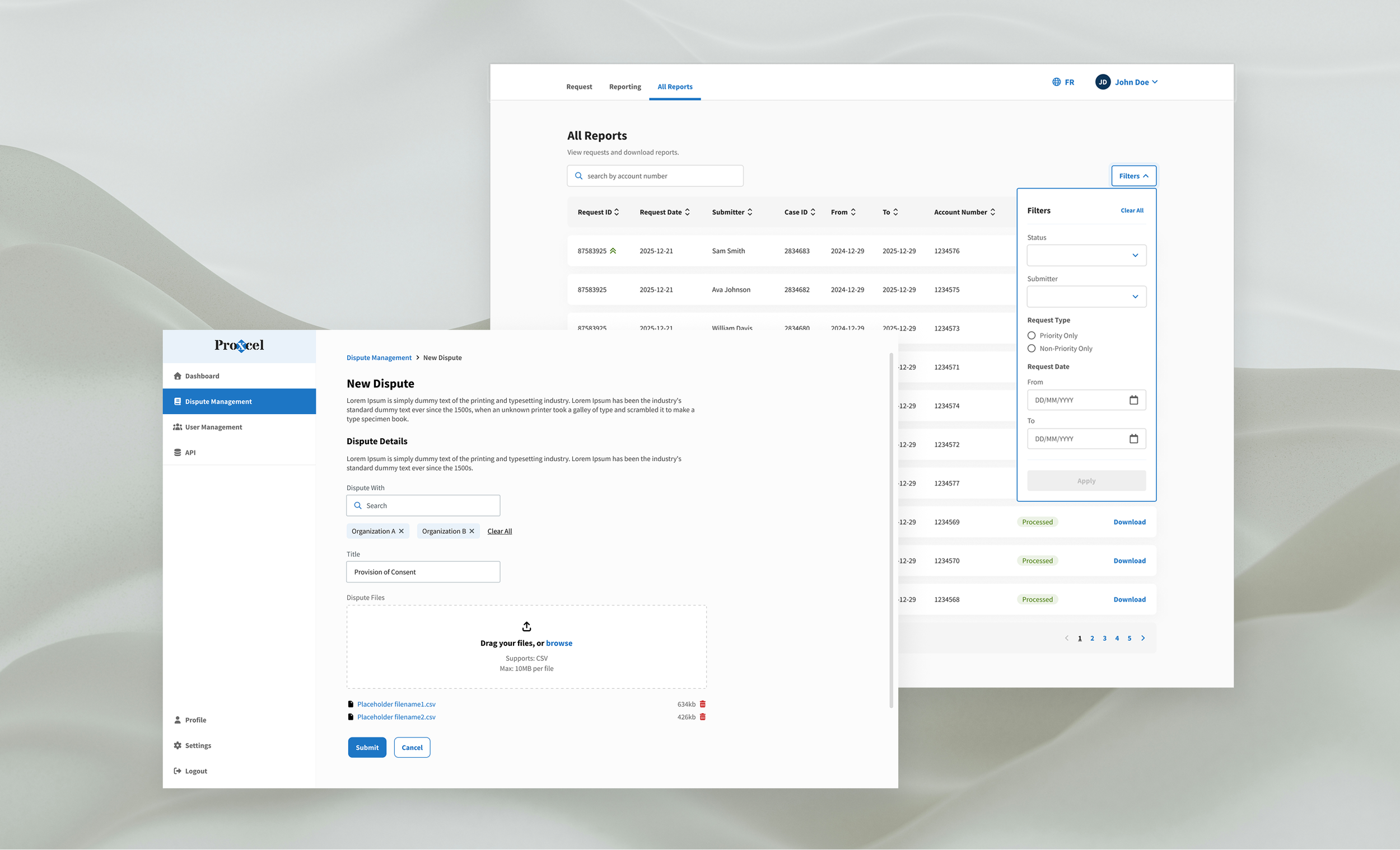
Symcor Design System — AI-Assisted Workflows
Context
Symcor | 2024–Present
A 3-person design team supporting multiple product teams, each with its own developers and product owners. Inconsistent patterns across products meant duplicated work, slower delivery, and uneven user experiences.
The Challenge
Build a shared design foundation that scales across distributed teams — while aligning existing products with company branding guidelines and accessibility standards.
Role
Lead designer. Owned the full design lifecycle: audit, component design, documentation, and governance.
Key Design Decisions
Components mapped to Tailwind CSS for 1:1 design-to-code parity
Built for flexibility — teams can adopt incrementally, not all-or-nothing
A governance model that balances consistency with team autonomy
Structured for easy onboarding and long-term scalability
Impact
Now serves 4+ product teams across Symcor. Reduced design-to-dev friction and enabled a small team to support multiple product initiatives without sacrificing consistency. That reach also made the library usable as context for AI-assisted prototyping.
Components
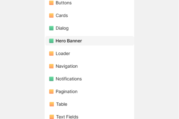
Full range of states, sizes, and variants. Built for incremental adoption — teams integrate what they need without overhauling existing work. Usage guidance is built in to reduce designer-developer back-and-forth.
Use Cases
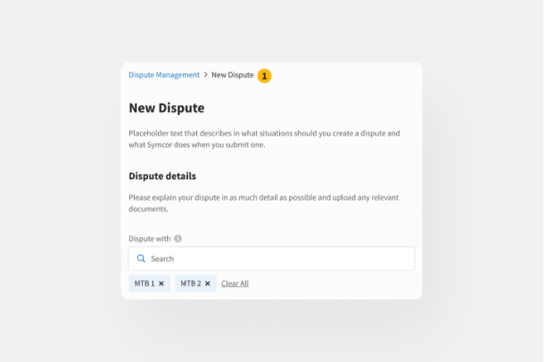
Shows how patterns behave in real product contexts. Closes the gap between "the component exists" and "the team knows how to use it."
Color Palette
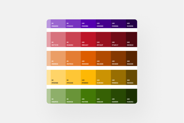
Six hue families — grey, purple, red, orange, yellow, and green — each scaled across 10 tint-to-shade steps. Built from Symcor's brand guidelines and extended to meet WCAG standards, giving product teams a precise, consistent range to draw from.
Variables
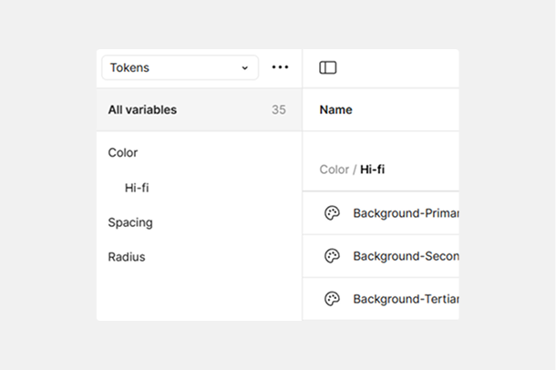
Token-based system covering color, spacing, and radius. Creates a shared language between design and development so decisions translate to code without interpretation gaps.
Iconography
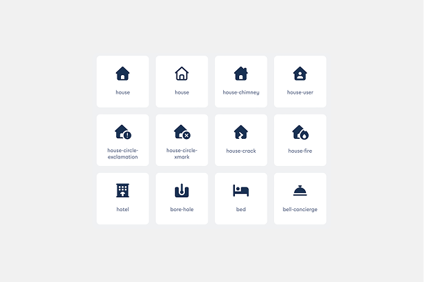
Scoped to Symcor's product contexts. Named and categorized systematically so icons are easy to find and apply consistently, without informal conventions or duplicate assets.
Where the system meets AI
Component Properties
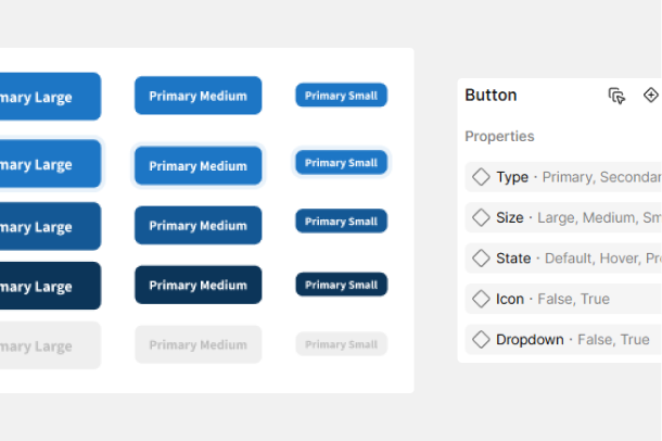
Controlled properties — type, size, state, icon, dropdown — give teams flexibility without breaking system integrity. Modeled around how developers actually consume components to keep handoff direct.
Figma Make doesn't reliably reproduce a system's components, so the practical question is how much manual setup is worth doing to keep the output usable.
What I've settled on: build the key frames by hand from real library components and feed those in as references, with the library linked as a second layer. The manual part is deliberately narrow — enough to get Make producing output that reads as the system, not so much that I've rebuilt the thing myself and lost the speed I came for.
When the generated screens use the same components already in production across different product teams, reviewers recognise them and stop treating the visual layer as an open question — the session goes to the experience instead. I've worked this way on several internal tools, including an API monitoring portal and an ongoing redesign of our suspicious cheque review portal. I've seen the same shift in both: people stop critiquing screens and start telling me how they'd actually use it.